It’s the perfect and most essential complement to a great SharePoint intranet page - titles and dividers that make page navigation easier and help structure content. Our latest Title web part helps both label and help identify content while the Dividers web part offers much needed space to an otherwise busy page. And the best part? The two visual elements can be combined with each other to design the perfect page.
A unified intranet experience
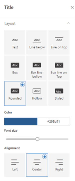
So what is the Title web part? Title provides a label for your content areas and comes with several different layouts that you can use to add flair to your title text. Make the content more readable by applying a branded title on top of each web part that inherits your theme fonts and colors - making for a consistent user experience.

With this web part it’s possible to configure color selection, title font and size, and horizontal alignments. They can be extremely big or small, centered or not...there’s an option for every situation and every taste.

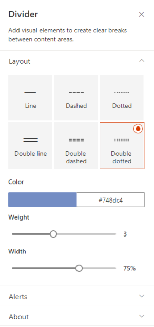
What about the Divider web part? Like the Title web part, it provides much needed visual page elements that create more prominent space between content blocks and areas. Space on a page can help with comprehension and aid in navigation.

As our customers have come to expect from BindTuning web parts, you can choose between different layouts (six!), a variety of colors, and also to define weight and width of the divider elements. This will help you style dividers in accordance to your branding guidelines.

More Modern web parts
Title and Divider web parts are the latest web parts from BindTuning to feature the modern look and feel, updated experience, and brand new features. We are continuing to roll out the modern experience to all of our web parts over the coming weeks. Visit our Build page for a complete list of modern web parts.
Get a demo


